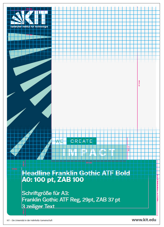
Structure and Grid
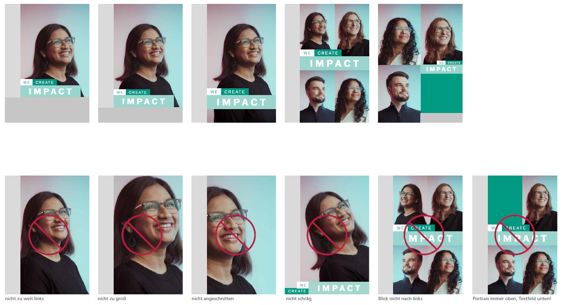
Clearly structured, visually bold and eye-catching. The communication media for the employer brand make consistent use of a modular design logic and impress with concise combinations of image, text and color. The bold image style immediately attracts attention with its eye-catching design and color gradient. The result is a flexible design that can be used individually and always focuses on people and their impact.
Basic Structure
Using the example of a poster
- All elements are located within the field grid from the superordinate corporate design of the KIT.
- All area sizes are a multiple of the predefined fields.
- The KIT media frame limits the layout.
- The KIT logo is either on:
- monochrome, dark blue background (variant "graphic element on the left"). The rays of the graphic element must not touch the KIT logo.
- or on the background of the photo (variant "graphic element on the right").
- The position of the claim is at the bottom of the image motif. Depending on the variant, on the left or right.
- The headline and subheadline are always in the green field. The subline may also be multi-line.