
Accessible Websites
Websites of public sector bodies should also be accessible to people with disabilities so that visual, hearing, or mobility impairments do not negatively affect their use. This is regulated by the EU Directive on the accessibility of the websites and mobile applications of public sector bodies and the Landesgesetz zur Gleichstellung von Menschen mit Behinderungen (State Law on the Equality of People with Disabilities). As a public institution, KIT is therefore obliged to create accessible websites, documents, and mobile applications.
Below are some tips for creating accessible websites.
sprungmarken_marker_564
Text
Use the OpenText styles of the text editor to structure your content. This ensures that continuous text, headings, lists, etc. are correctly marked in the HTML code, making it easier for people with visual impairments to navigate the page.
In addition, please note the following information on individual structural elements:
- Headings
Use the H1 to H6 styles and organize headings in a logical hierarchy. That means, start with H1 and then continue with H2 in the following sections. Do not skip heading levels or present headings as bold normal text. - Tables
Create tables with a simple structure and column headings. Tables are suitable for presenting information in columns or rows, not for designing the page visually, i.e. positioning images and text on a page. - Lists
Do not use hyphens or indent text with spaces to create lists.. - Hyperlink Text
The text of the link should convey information about where the link leads.
Instead of: For further information click here.
Write, for example: Further information can be found in the editorial manual.
Images and Graphics
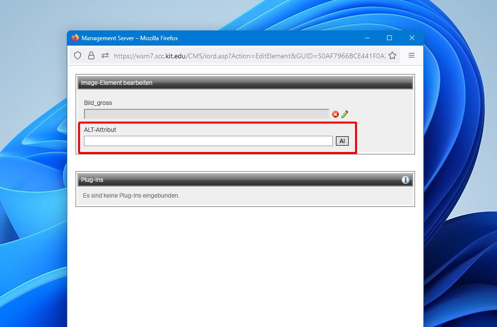
Add descriptive alternative text to informative images and graphics (ALT attribute in OpenText). Screen readers use alternative text for voice output, allowing people with visual impairments to understand what is shown in the image. The alternative text should not duplicate the image caption, but should concisely describe the essential content of the image. The “AI” (artificial intelligence) feature helps you create image descriptions.
Images that are used solely as decorative elements in the design of the page do not require alternative text.
Linked images and graphics should have the link destination named in the alternative text so that it is clear where the link is going. For example, the alternative text of a news image may include the title of the linked page.
Color Contrast
To ensure that text is easy to read, there must be sufficient contrast with the background color. OpenText provides several image templates with text, such as teaser boxes, media widgets, or header images. When using these, make sure the text on the image is clearly legible. Teaser boxes and header images have an additional dark color gradient ("shadow") that can be removed if the text is still legible or if the image does not contain any text.

Low color contrast (shadow off).
Sufficient color contrast (shadow enabled).
Video and Audio Files
Deaf people need a textual alternative (e.g. subtitles) to access video and audio content. The media portal of the KIT Library automatically generates subtitles for video and audio files in German and English. The OpenText template "Video/Audio" allows you to integrate videos from the media portal, including subtitles, into your website.
More information about videos with subtitles.
Documents
Documents you offer for download also have to be accessible. PDF documents based on Word templates are often found on the Web. If you keep a few things in mind when creating the Word document, the PDF document will be largely accessible after conversion.
- Use easy-to-read fonts (serif-free fonts, such as Arial) and font sizes.
- Do not use color to convey information; content should be understandable in black and white. If colors are used, provide sufficient contrast.
- Structure text using styles for titles, headings, lists, and tables.
- Provide alternative text for images and mark purely decorative elements as "decorative".
- Specify the language of the document
- Enter the title in the file properties
Finally, run an accessibility check in Word. Alternatively, you can use Adobe Acrobat Pro to check a PDF document for accessibility and add any missing attributes.
